Case Study: Move.org Redesign
Project story
The Engineering team led a significant initiative to transfer every site in the department to a new WordPress platform. Each site would improve the site performance by migrating to the new system. It also provides teams with a webpage builder that is easier to create web articles. I work on a site that produces service reviews and resources for moving, and our turn came to transfer the site.
The top priority was to migrate an editorial website with 300 articles to a new platform as a team. My task as a visual designer was to make updates to the current design style to fit into the new platform's frameworks. I discovered that it would require many updates on the visuals to fit into the frameworks. So I took that as an opportunity to redesign the visuals and improve the readability.
Defining the problems
Discovering problems from research
After realizing it was an opportunity to improve the site visually, I tried to learn about its current state. I was absent from the team for a year to work on the new platform. The team members and the editorial strategy had changed. So, I looked through the current site in detail and asked questions to the Content Strategist and the Managing Editor. Then, I gathered the possible problems to tackle.
The site added a few components from other sites without style adjustments.
The articles use more components, and it looks busy overall.
It seems challenging to skim where each section starts and ends.
The call-to-action buttons might not be standing out.
The color palette was limited to green, black, and gray colors, resulting in many green colors on the page.
I was questioning whether the primary illustration style is a good direction or not.
Deciding which problems to tackle
I asked the team members what mattered to them and the site. The majority of their comments landed on those two.
Increase the clicking rate to the affiliate links
Make the articles easy to follow
Then, I decided to tackle those problems.
The call-to-action buttons might not be standing out.
It seems challenging to skim where each section starts and ends.
I was questioning whether the primary illustration style is a good direction or not.
There is a lot of green colors on the page. The call-to-action buttons might not be standing out.
The articles use more components and look busy overall to follow the content and understand where each section starts and ends.
I had been questioning the illustration style for the homepage hero image. I felt like there would be a better direction for the site.
Defining my goals
After defining the problems that I wanted to tackle, I set my goals.
Follow the new platform's guidelines and frameworks and create a style guide design file for the Engineering team
Make the call-to-action buttons stand out more
Make it clear where each section starts and ends, so it's easy to follow the content
Find a better direction with the imagery style
Redesigning The Visual Style
Learning the editorial strategy
I took the time to learn more about the editorial team's strategy. The editorial team that writes and publishes the content is the central piece of the site. Learning its vision could help me to make better design decisions. I wanted to try a keywords map approach as an exercise. I scheduled a meeting, and the team shared their thoughts with me. I selected the keywords from the conversation and put them together on the map.
Working on call-to-action buttons
The original design style had a limited color palette. As a result, most of the components had green hues, and there were many green colors on the page. The call-to-action buttons had enough visual weight to be noticeable, but I thought they could stand out more.
The new platform's framework allows having primary, secondary, tertiary, and gray colors. If I introduce another color to the style and use it for most components, it could save the green color only for the buttons and the logo, which could differentiate the buttons from the rest.
I went through a couple of rounds of color exploration.
[Screenshots of color exploration mockups]
After having discussions and getting feedback from the Design Manager and the Creative Director, we landed on a set of colors of gradient green and blue.
[Screenshot of the mockup with the decided colors]
Making the headings to stand out
The articles use the comparison table, the pros and cons card, and the callout cards. Those components add more visual interest, and they are more effective in displaying the information than a chunk of text. However, each piece seemed to have enough visual weight to overwhelm the headings. With a header, readers can understand what this section is about and decide to read or skip. Since the article seemed busy, I strongly felt that we could reduce the visual weights of each component and make the section heading stand out more.
I reduced the visual weights of the often-used components.
[The pros and cons component - original and redesign]
[The comparison table component - original and redesign]
The editorial team is fond of callout cards. I've found an article that uses 15 of them. The card has a heavy gray background. I changed it to white background and redesigned the icons with flat colors. The colored icons appear to bring enough attention to the information on the card. The lighter tints of the colors seemed softer and approachable. During this exploration, I found out I liked the color combination of blue and pink, which I often used for other visuals.
[The callout component - original and redesign]
[The icons for the callout component - original and redesign]
I had to change the font to Google fonts from Proxima Nova. I was looking for a typeface with a heavier weight that won't easily blend in the page.
I tried a few rounds of font explorations.
[Screenshots of typography exploration mockups]
After having discussions and getting feedback from the Design Manager and the Creative Director, we landed on the typeface of Nunito Sans fonts.
[Design mockup of the typography with Nunito Sans typeface]
Finding a better direction with the imagery style
The quality of stock photos relating to moving was always questionable. That's why I went with the Illustration-style. But then, I wasn't sure if the style was narrowing the direction in the wrong way.
[The original image style]
The Brand Partner team told us that the partner companies might provide us with high-quality service photos in the future. Then, I wanted to incorporate photos into the imagery. Using both illustration and photography would keep the style flexible and open. So, I started exploring a style to combine the two.
After a couple of rounds of design revisions, I felt good about the overall direction for the image style.
What was completed at the end of the project?
After a long process and hard work from the whole team, we completed the migration project.
• The whole website with 300 articles transferred to a new platform
• The call-to-action buttons are not blended into the page
• The article feels less busy and has a sense of grouping
• Imagery style has the flexibility
[U-HAUL Brand Review article]
[U-HAUL Brand Review article - original and redesign]
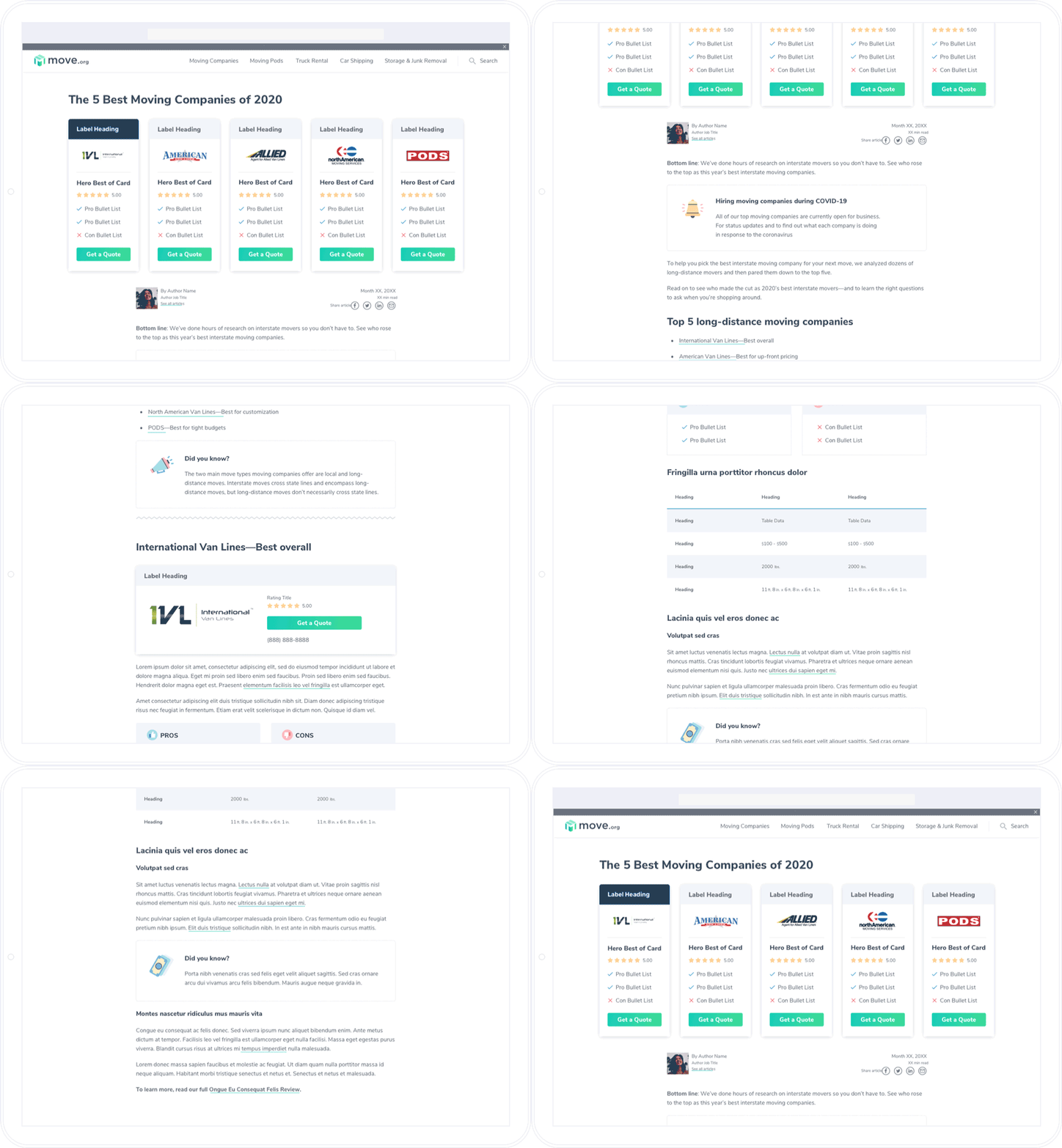
[Move.org Homepage - original and redesign]
The Engineering team launched the new site in mid-April, which was right before the moving season. The group felt very nervous. But, the Website Manager and Director told us that the business performance showed no signs of drops. The site ended up having an excellent moving season in business. The revenue in June showed 200% growth from the prior year. It's safe to say the improvement of the loading speed helped, but it's hard to tell if the visual updates helped or not. The revenue number was getting better even before the new launch. It might have performed at the same level or even better. I could only be happy that the redesign didn't kill the momentum.
Afterthoughts
It was also a great project that required me a lot of collaboration with team members.
I had a chance to ask questions, discuss code bugs, and communicate design solutions with the Engineering team.
It was helpful for me to learn the vocabulary the Editorial team uses. I felt the communication was better when I started using the same language to discuss the visual styles.
One of the most challenging parts of the process was running the content check for each of the 300 articles. I've got to collaborate with the Content Strategist and the Project Manager. We had to sync several times to create the guidelines for the content check, sort out the bug report process, and inform the whole group of what type of issues had come up. It was one of the most collaborative projects that I've ever done.
Go back to Case Studies page


