Case Study: AT&T Checkout System
Background
Clearlink has a partnership with AT&T selling its services as an authorized retailer. AT&T upgraded its back-end system, and Clearlink needed to update its system. The team assigned me to make design adjustments. But, I took steps to do research and testing to revise the design, not for the system upgrade but for the customers.
Project Goals
Update the pages to be responsive (previously available on desktop only)
Optimize the current design to increase the completion rates
Follow a good design process that includes user testing
My role and the project members
My role as a web designer:
The cross functional team members:
The stakeholders:
Define the process
Research
Sketch and wireframe
Design and prototype
Assist usability testing
Ship design files
Communicate with team members and stakeholders
Copywriter
User researcher manager
Frontend engineer
3 backend engineers
Technical project manager
Creative director
Director of content
Engineering Director
Website manager
Website director
Compliance specialist
Chief marketing officer
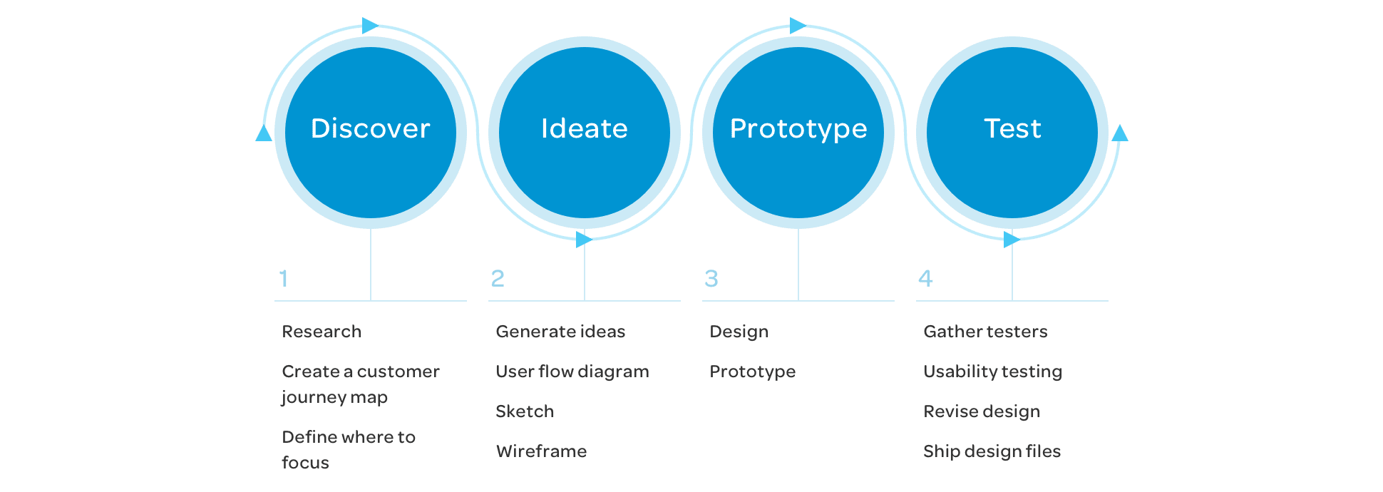
Design Process
1 Discover
Research
During the discovery phase, the copywriter and I teamed up and researched anything that could help us make better decisions.
Look into google analytics data on the current checkout system
Visit the sales department and interview the sales agents who communicate with customers through phone and chat
Research competitors' checkout systems
Research e-commerce best practices
Analytics data
I looked up the unique page views at each step in the event tracking and calculated how many customers went to the next step and how many dropped off.
Visit call center
The copywriter and I interviewed the sales agents who daily communicate with customers on the phone and on the chat channel. We heard that upselling home phone service was challenging.
Competitors research
I went through a few competitors' checkout systems and took some screenshots and notes. Some had cool animation effects.
E-commerce best practices
The copywriter and I researched the best practices in e-commerce as the importance of a progress bar, etc.
User journey map
After the research, I put together a user journey map about the current state. Then, we discussed it as a group. Finally, I suggested which sections we wanted to focus on for this phase.
Create a user journey map from the google analytics data
Define which sections to focus on
Customer journey map: AT&T checkout system
I shared what seemed to be the pain points for users with the copywriter. Then, I shared the user journey map and suggested which areas we could focus on with the whole team.
The journey map showed that many customers were dropping off at the first few sections. We decided to focus on the following:
Checking Availability
Select services
Finalize order
2 Ideate
During the ideate phase, I gathered ideas that I wanted to try. Then, I created the user flow diagrams, sketched them on paper, and built the wireframes.
Gather ideas
User flow diagram
Sketch ideas
Wireframe the whole flow
Gather ideas
Example - Checking availability
In this first section, Users can check if any AT&T service is available by entering their street address.
(A) Most e-commerce articles point out that the progress bar must be visible from the first screen. Unfortunately, it doesn't appear in our current system until the user's address is validated for availability.
(B) The check box titled, "This is a business address" probably isn't clear. We could create a different path for users who specifically want business services.
(C) There are three phone numbers on the side column:
- one for current customers who want to upgrade
- one for movers who want to transfer their service
- one for visitors who need customer support
We should question and decide if we could remove any of them.
Define the user flow
After gathering ideas, working on user flow and creating the user flow diagrams were the first step. I sketched the basic wireframe and critical elements on paper. Then, working on more detailed wireframes for mobile screens came next. I shared the user the wireframe with the team and stakeholders and received feedback on the whole flow.
User flow diagram
Sketch on paper
Wireframe
3 Prototype
During the prototype phase, I designed all UI screens for the checkout. Then, I collaborated on the usability test with the user researcher manager and completed the prototype.
Design UI screens
Complete the prototype
Design
I designed each path and all of the checkout system UI screens.
Loading screens
The back-end engineers reported that a couple of sections might take some time to receive the data back from the AT&T system. So, I explored animations for extended loading screens, and we prepared saving tips and good-to-know information.
Loading screen with saving tips and good-to-know info
Loading screen animations
Prototype
After talking with the User Researcher manager about the usability test, I exported all the screens we needed and made the prototype with inVision. I prepared both desktop and mobile versions with a couple of variations.
4 Test
During the test phase, we internally gathered testers. Then, the user research manager conducted the usability tests.
Conduct usability tests with seven internal testers
Learn the feedback from the tests
Conduct the usability test
I collaborated with our newly hired user research manager to discuss the game plan for the usability testing. Time was ticking fast. We decided to focus on the first half. We tried to find workers who had nothing to do with the site. We asked testers to go through those sections and tell their feelings, thoughts, and feedback.
All testers allowed us to record both the device screens and the testers themselves, which allowed me to see their responses directly.
Usability test feedback
Check availability section
It is clear to me that I need to enter the street address.
I understand I need to tap the correct address from the options (Google address autocorrect).
I would click the "service for business address" if interested in the business service.
Choose service section
I think I understand what "see popular packages" and "build my own bundle" mean.
I didn't notice the promotion banners about the bundle discount on the Internet price below.
I think these packages include some discounts (Yellow internet discount callout).
I understand that I can click the icon buttons and change the service type.
I didn't get that the icon buttons are clickable, and they could filter the packages (See popular packages). But, I got it once I saw the difference between the blue state and gray state.
I noticed the filter, and I would click it if I wanted to use it.
I noticed the number of available packages.
I think I understand what I'm supposed to do here (Build my own bundle path).
The progress bar is helpful (Build my own bundle path).
Account setup section
I understand I have a choice to provide my driver's license or my social security number for a credit check.
I understand what the passcode means.
Finalize the order section
I understand that I have to open the first tab here.
I understand that I have to answer all of those questions.
I liked the progress bar in the previous step (Build my own bundle). I wish it were here.
I understand what order summary is. I know I can click it to see the details.
Revisions
I made design revisions based on the feedback from the testers and the recommendations from the user researcher manager.
Make design revisions based on the feedback from the usability test
Complete the final design and hand off the file to the Engineering team
Check availability section
Original - Enter your street address screen
Redesign - Enter your street address screen
Main points for the redesign:
(D) Add the progress bar at this very first step.
(E) Separate the paths for checking AT&T residential service availability for business service.
(F) Customers interested in business services can call or fill out the form for contact.
Select services section
This section is where users make a selection for their service plan.
Original - Select the type of services
Original - Select a popular package
Original - Build my own bundle
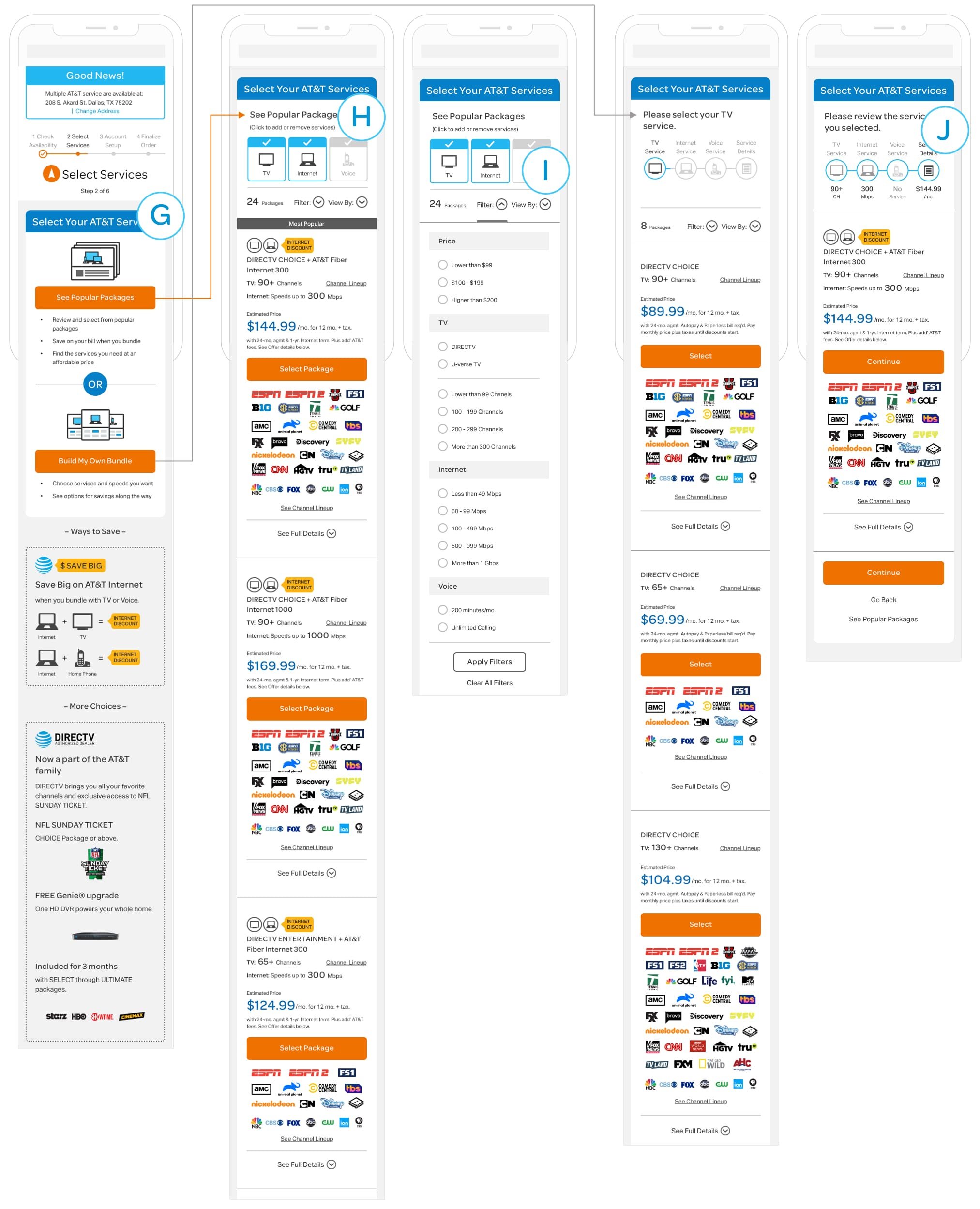
Redesign - Select services section
Main points for the redesign:
(G) In the original version, the main path is to guide users to a list of popular plans. But, there is a "Build my own" button on the side column as a secondary path that got many clicks. It could tell that some users may prefer to build their service plans flexibly. The redesign provides both the "See Popular Packages" and the "Build My Own Bundle" to see if users have a preference.
(H) In the original version, users have to choose a type of service first to see packages with prices. Then, if users want to see a different service plan, they have to go back a step and reselect a service type. The redesign provides icon filters to view packages flexibly.
(I) The redesign provides a filter feature to help search the packages users want to purchase.
(J) The redesign provides a progress bar that shows a key feature of each service.
Finalize order section
Users answer a set of questions to customize the details for their services. For example, the questions include the installation methods, the internet modem options, the premium channels, etc.
Original
Redesign
Main points for the redesign:
(K) The original version divides the questions into a few groups and presents the question in a pop-up window one by one. The redesign tries collapsable tabs.
(L) One tester mentioned that he liked the progress bar on the Build Your Own Bundle path. He wished that bar was here at this section.
(M) The user research manager recommended adopting the feedback from a tester. The whole team members and stakeholders agreed. The revised design followed the same pattern as the Build My Own Bundle section.
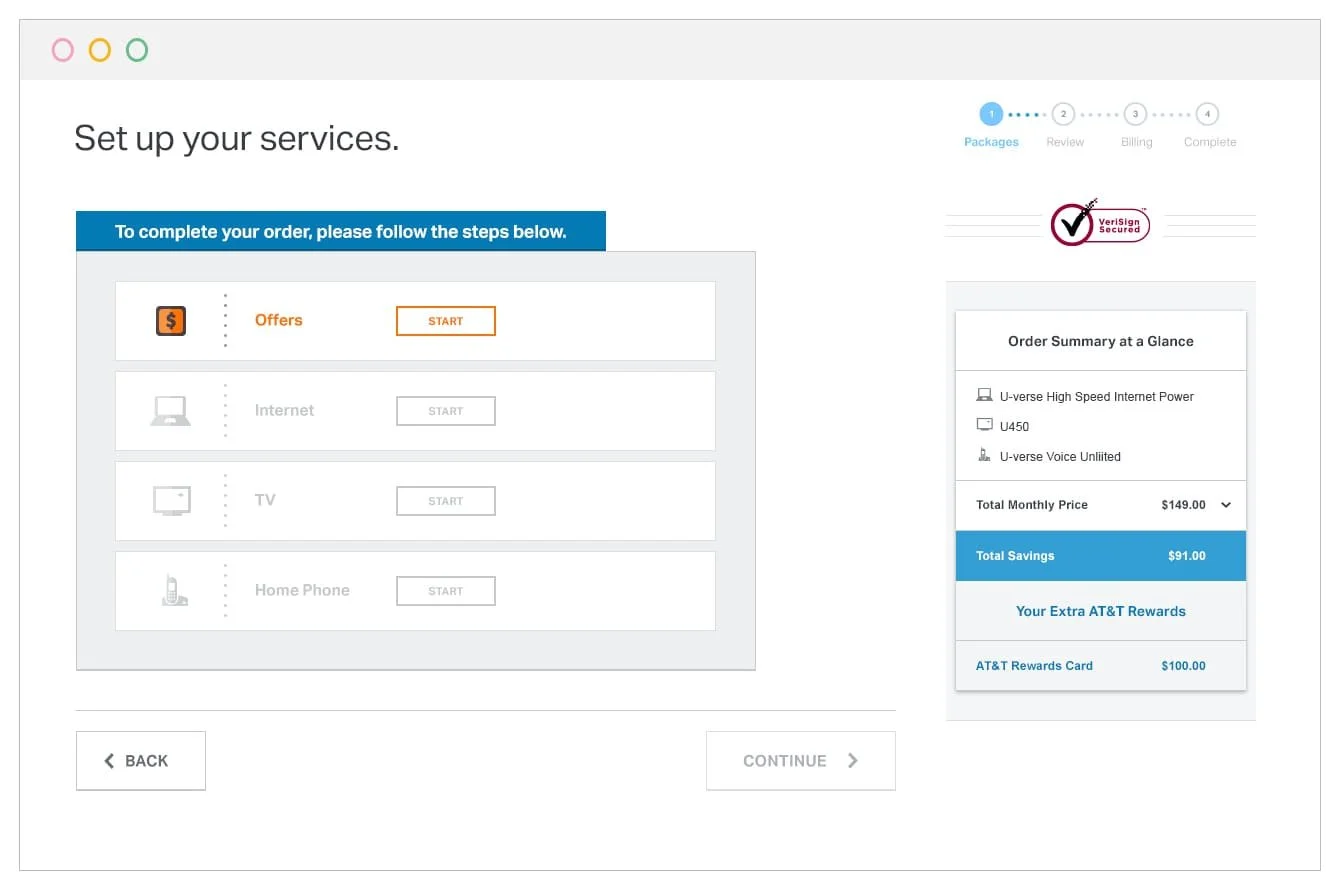
Installation info section
Users need to select the installation date and time in this section.
Original
Redesign
Main points for the redesign:
(N) Analytics data showed that many customers were dropping off at this step. The original version just had a dropdown. I wanted to try a table that shows the date and time slot.
Retrospective
Of course, there were many things I could have done better. For example, I could have done user testing with the original version and gathered insights. In addition, I could have quickly tested concepts using wireframe versions instead of waiting until I completed the polished prototype.
We sent the design file to the engineers for development. The data analytics team set up a tracking system on this online order system. We hoped to measure the performance and optimize the system further, even doing more user testing and interviews in the future.
After a few months of development, the checkout system went live, but the system didn't quite work as we hoped. For example, the recordings showed problems where the same steps were looping, or users went back to the early stage after making progress. The engineering team investigated the issues, and they reported it would require a lot of engineering resources to fix the problems and maintain the system. So the stakeholders, unfortunately, decided to shut down the checkout system.
Overall, there were a lot of good learnings from the project. Significantly, the feedback from the usability tests was so helpful. It was fortunate that the department hired the user researcher position, and I could get help from him.
Go back to Case Studies page


