Case Study: Comparison Table Component
Background
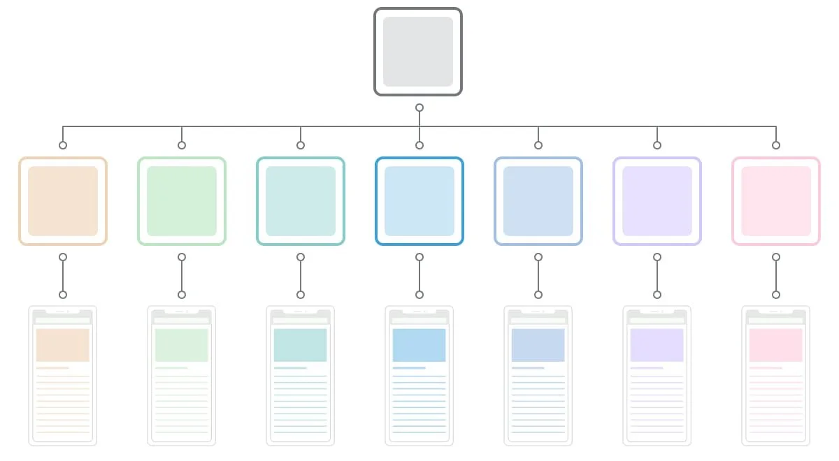
Our department runs ten editorial WordPress sites. Each publishes service reviews for people searching for Internet, TV, home security, small business, health insurance, and moving resources. Most sites were developed uniquely by different engineers, but they use similar web components to display information. The Engineering team proposed to build a global system that could manage all sites instead of maintaining each individually. The executives approved it, and the Engineering team and the Creative Director worked on a custom webpage builder system. I joined the team and worked on the customized web components as a part of the web page builder.
Maintaining each site individually
Create a global system that could apply to all sites
One of the first web components I tackled was the Comparison Table component. It's the most used component, and visitors often click the call-to-action items in the table. All teams consider this to have a direct impact on business success. So I wanted to define and design a practical table component that meets every team's needs.
Team members
Engineering Director
Engineering Manager
2 Engineering Leads
Creative Director
Web Designer(me)
Time to design the Component
3 weeks
Project goal
Define and design a Comparison Table component that meets the needs of each site and team.
Process
Discover
Research what each team needs
Define
Decide what features to include
Design
Design the default style and the features
Deliver
Deliver a design file to the Engineering
Discover
I uncovered what I needed to learn for this project and researched it. The primary item was to understand what type of table components each site required.
Understand what the engineering team needs
Research what features the brand teams need
Research the visual styles on all sites
Understand what to deliver to the engineering team
At first, I communicated with the engineering leads and asked many questions about the project. Then, I learned what I need to design and deliver to the engineering team. The items are web component wireframe, visual default style for the global system, and the web component design with documentation.
Web component wireframe
Web component design in default style
Understand the key features for each site
I went through all the sites to understand the current state with the Comparison Table component. Then, I looked into the features and information going inside the tables. And, the most critical task was to interview the content strategist and website manager from each team. I learned how they build comparison tables. I listened to their pain points. They shared what features they like and new features they wish to have. In the end, I gathered all the ideas from the research.
The pain points each team has
No way to convert a horizontal table into a vertical table or vice versa
We have to add shortcodes to style texts, text links, buttons, phone numbers, etc.
Images and logos are difficult to deal with(vertically tall images, sizing, Amazon products, background color)
No way to remove the default items and styles
No way to change Text (size, color, alignment, weight)
No way to change the color of cell/row/column
Amazon products' pricing info needs to be updated manually
No way to control the column width and row height
No way to insert Image/Logo and Text in the same cell
Tables automatically stretch to the column width
The table looks broken when you have more than 5-7 columns on the mobile screen
Hiding specific rows on mobile doesn’t adjust the alternating gray colors
There are several table options, but they seem to have bugs
Needs to keep your finger on to the table to side-scroll the table
The features each team wants
Convert vertical table into a horizontal table (vice versa)
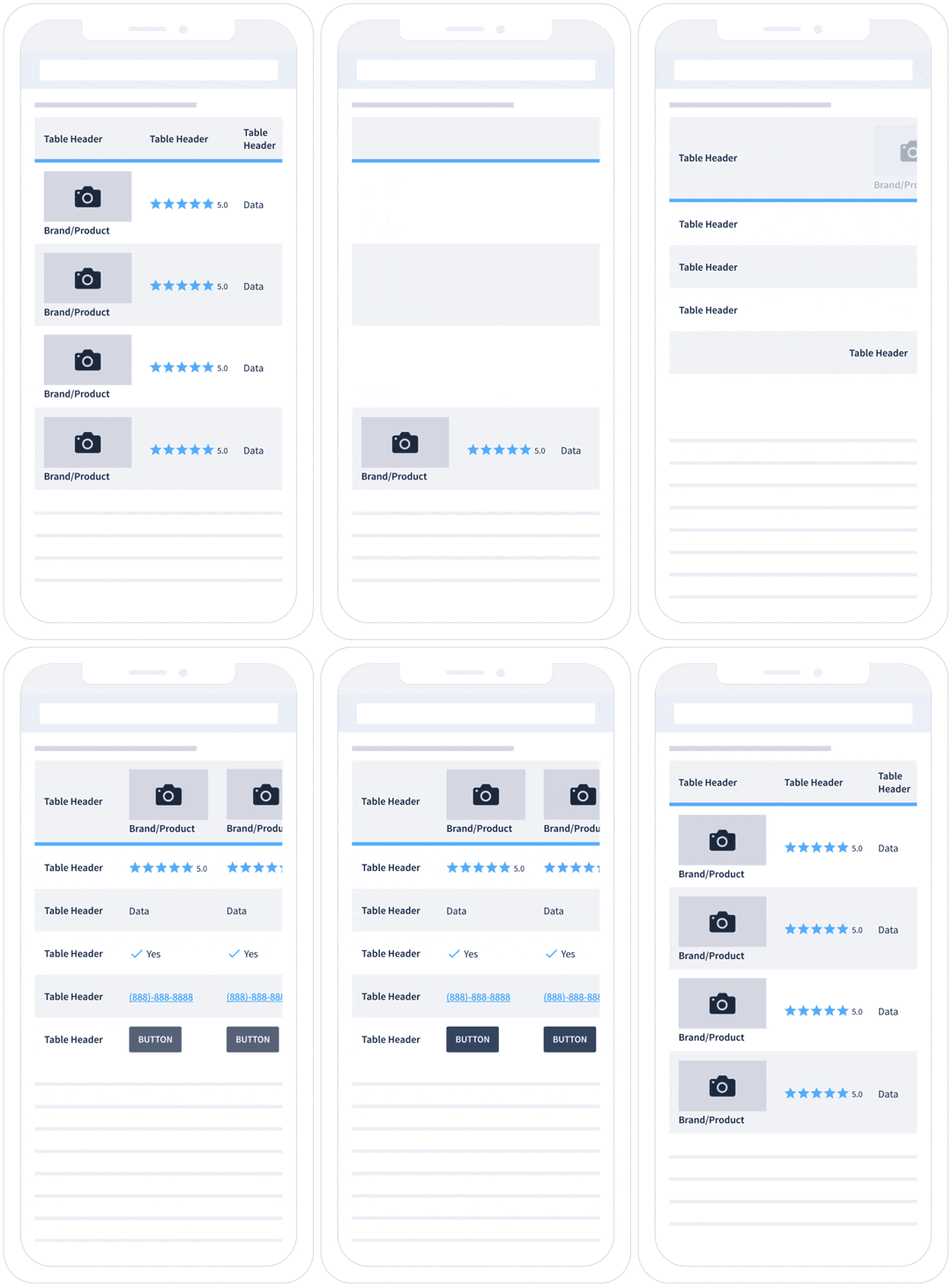
Mobile - Sticky left column and side-scrolling
Mobile - Phone number to be clickable
Function to connect to the Amazon API and maintain its pricing info with an option to be a clickable link
Emphasized column/row with a callout label
Alternating color feature - Apply it to rows or columns and an option to turn off
Complete control on text styling(size, weight, color, and alignment)
Function to control the padding inside buttons
Option to turn images to be clickable (logos, product images, any other images)
Function to control the padding space inside the cell
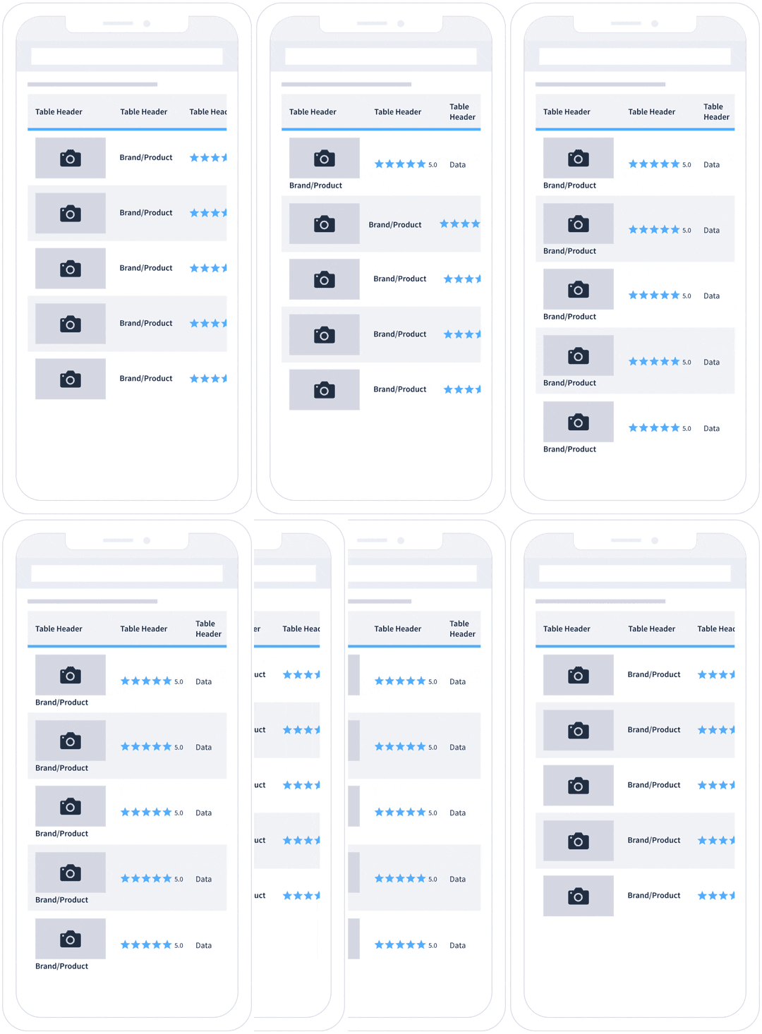
Feature to select equal column width or flexibly set each column width
“Sorting by” function that users can change the order of columns or cells.
Option to place image/logo and name text in one cell
Filter function that users can choose to show or hide specific columns or rows
Function to build a table from uploading a .cs file
Filter for users to highlight the differentiating factors
Highlight function - Users can highlight a particular column or row
Option to set a fixed height(area) to be scrollable for a channel lineup
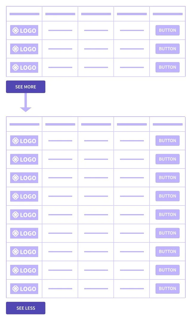
Function to hide a part of the table and show with “see more” button
Tab options that users can click through at the top of the table
Define
I shared the findings from the research with the Creative Director and the Engineering Leads. Then, we mainly discussed the features for the Comparison Table component.
Define the features
Define the options for visual styling
Define the features
After adding a few items to the group, I outlined the list as a proposal with screenshots and basic wireframes.
Feature examples
Convert table (horizontal - vertical)
Emphasized row/column with a callout
Mobile: Clickable Phone Number
Image/Logo & text in a cell
Mobile: Sticky column & Side-scrolling
Build a table from a CSV file
Connect Amazon API to pricing info
Hide and show rows
I shared it with the Creative Director and the Engineering Leads. We discussed each element as to how this could be helpful for the content strategists and the readers and what would be the technical difficulty to develop the feature. The two Engineer Leads decided which features to implement first and which features to create later.
Define the options for visual styling
I also had to consider the visual styling options, so each site's designer could have some flexibility to design their comparison tables. I asked the design team what styles they have for the comparison table components and which styling options they want. Then, I asked the Engineers if it would be possible to build visual choices with the background color, lines color, line thickness, and flair. The Engineering team was good with them, and I include them in the styling options.
Original comparison table components design
Visual styling options
Option to flexibly set background colors
Option to stylize table lines
Option to use alternating colors (Horizontal and Vertical)
Option to add flair anywhere in the table
Design
I designed the default style of the Comparison Table component. Then, I created the layout with the selected features. I revised the design with the Creative Director. I communicated with the Engineering Leads to understand what type of documentation their team needed.
Design the default style
Design the features
Design the default style
The webpage builder system needed a visual base, which engineers called default style. The default style mainly helped teams as a communication tool to demonstrate what was possible. I focused the design on being basic and straightforward to display the features solely.
Tablet Device: Default Style
Design the features
I designed the table features that the engineering team chose. I also asked the engineers what information they needed in the design file to make good documentation. The engineering team was good with those features.
Convert vertical table into a horizontal table (vice versa)
Mobile - Sticky left column and side-scrolling
Mobile - Phone number to be clickable
Emphasized column/row with a callout label
Alternating color feature - Apply it to rows or columns and an option to turn off
Option to turn images to be clickable (logos, product images, any other images)
Feature to select equal column width or flexibly set each column width
Function to hide a part of the table and show with “see more” button
Feature examples
Image/Logo & text in a cell
Convert table (horizontal - vertical)
Emphasized row/column with a callout
Hide and show rows
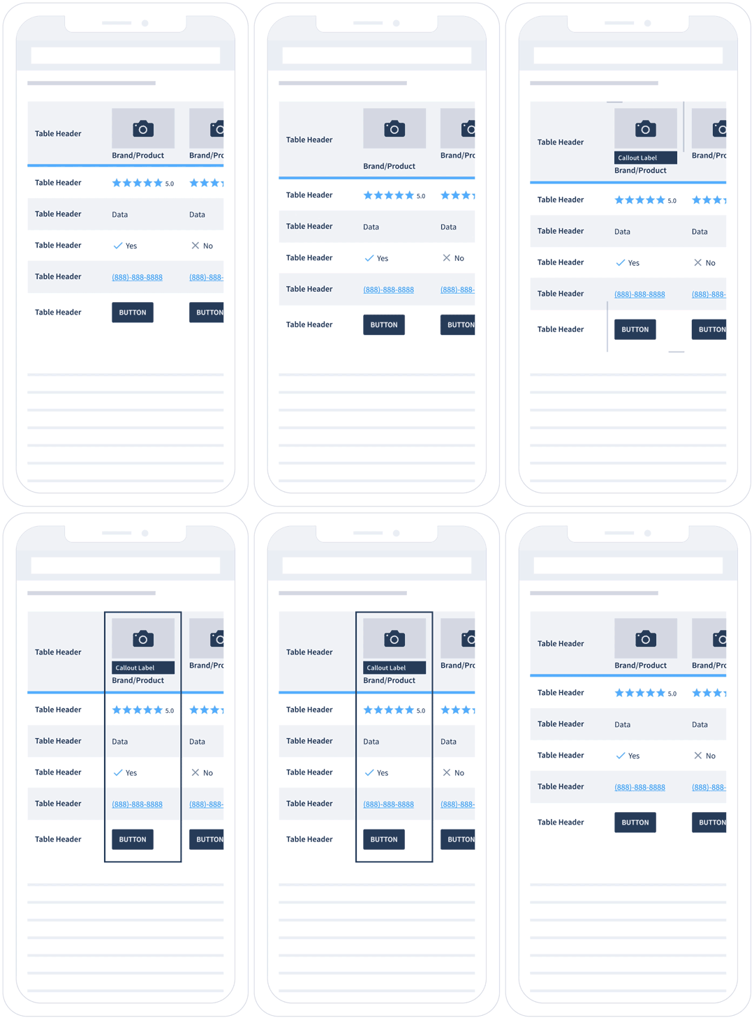
The most challenging feature was having the sticky left column and the side-scrolling function on mobile. The small mobile view is tricky. If the first column has a large image/logo or a long title/text, it could cover half of the screen. The readers need to see the rest of the information in that limited area. So, I suggested reducing the first column's width once the user side scrolls. It might only save 40-60 pixels, but I thought it would be helpful. I made a prototype to show the concept. When the side-scrolling begins, the logos/images, texts, or both will reduce their size, and the column width goes smaller to give more room for the rest. The Engineering Leads were good with the idea.
Sticky left column and side-scrolling feature
Animation to indicate that users can side-scroll
The visible area for side-scrolling
Prototype: Reduce the first column during side-scrolling
Deliver
The Comparison Table component was approved with its features. Next, I organized the design file, made all the documentation, and delivered the file to the Engineering team. Then, they worked on the development.
I also shared the web component file with the design team members, so they can update the visual styles to their brands.
The Engineering team worked hard and put life into the Comparison Table component. They built the webpage builder system and provided each group with an upgraded Comparison Tables component.
Default style table
Move.org’s style table
Retrospective
I caught up eventually, but I wished I'd asked more questions initially to Engineering Leads. Working on creating a web page builder was new to me. I had a good guess with the vocabulary they used, but I could have asked to be super sure.
It was an excellent opportunity to learn how Engineers think. They were advocating to have fewer styles. They showed me the benefits by showcasing the easiness of managing and updating a whole website system with fewer styles. I also enjoyed discussing ideas with them.
When a couple of sites adopted the sticky left column and side-scrolling feature on mobile, every team wanted that function. We all thought that was an excellent function for mobile users. So, when I worked on this project, I didn't explore other options. Instead, I wish I had questioned if that function is working well in the mobile view or not and prepared more options.
Go back to Case Studies page


